
Welcome to this new version of my personal site. It’s only the third version I ever put up, but probably the 6th or 7th I designed.
Designing your own site can often be frustrating and painful, as you throw away revision after revision in search of the perfect layout.
However, when things work out, you get a chance to produce something that’s truly personal, and shows a part of yourself. It’s probably the closest we web designers are ever going to get to “art”.
So here are a few notes about this redesign.
Finding a Purpose
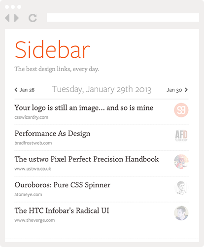
The first ever version of this site was a cross between a blog and portfolio, with both part of the site competing for attention and neither working very well.
The second version was almost a pure portfolio, and did a decent job of showcasing my design work. However, it didn’t communicate anything about who I was. For all visitors knew, I was just some guy somewhere designing user interfaces. Or maybe a particularly artistic robot.
For this third version, the needle swung all the way to the other side, and I decided to put the blog forward. Making that decision early on helped me avoid the designer’s block that can come when you try to accommodate too many constraints all at once.
Now that so many of my work can be off-loaded to sites like Dribbble or Cargo, it makes sense to favor blogging. So that’s why all the design choices I made went in the direction of facilitating reading and browsing the blog.
Beyond the Grid
This is also why I got rid of my trusty old friend, the 12-column grid. I’m not using any particular CSS framework, and that the sidebar and main content area width are not multiples of a common unit.
Of course, I’m still using consistent spacing, and making sure things line up. But with mobile sites and responsive design, I think the days of the grid as a monolithic, fixed-width entity are numbered.
Post by Post Design
You’ve probably noticed the recent trend of design blogs giving each post its own layout and design.
While I find this admirable, I knew that increasing the amount of work required to write a new post would most certainly decrease the number of post I’d write.
So I decided to compromise, and keep a constant layout but feature a different image for each post. This lets me go as crazy as I want for the main image, while not requiring any additional work for the rest of the content.
Take a Stand
One of my favorite web designers is Mike Kus, not just because he’s very good, but also because he has his own signature style.
While there’s nothing wrong with meeting client’s expectations, it can easily lead to following trends and taking the path of least resistance towards a safe design.
So for my personal site, I made a conscious effort not to rely too much on the usual drop shadows, 1px highlights, embossed effects, and other trappings of modern web design.
No matter if you like this design or not, at least I hope you’ll agree that it doesn’t look like any random WordPress theme!
Saying Goodbye
I’ll be blogging here from now on instead of on Attack of Design, my previous design blog. I’m not sure yet what I’ll do with the site, but in the meantime I’ll republish some of that blog’s best posts over here every couple days. It’ll be a good occasion to rediscover some old articles (and the debates they generated).
What do you think?
Let me know if you like this new design, or if you find a bug (which there are undoubtedly hundreds of, and I don’t even want to think about IE…).
Pingback: Introducing A New Blog | Attack Of Design